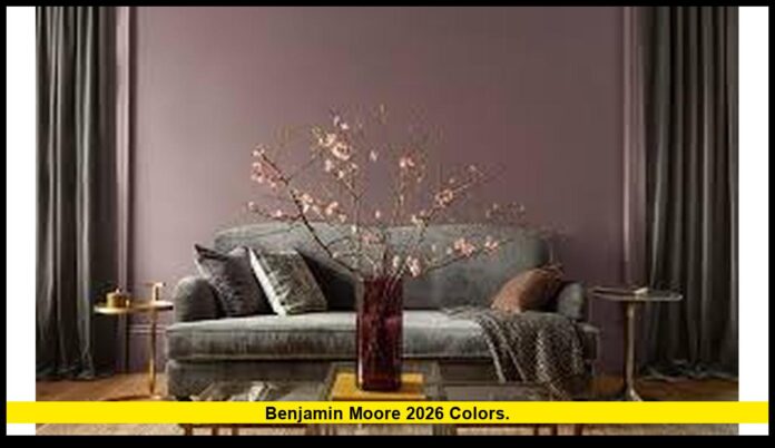
Benjamin Moore 2026 colors are officially here, and they are setting a bold, elegant tone for the year ahead. The paint brand has unveiled Silhouette (AF-655) as its 2026 Color of the Year, accompanied by a sophisticated eight-color palette that blends depth, warmth, and versatility. For homeowners, designers, and color lovers across the United States, this announcement signals a major shift toward richer, moodier hues designed to last.
Table of Contents
Silhouette (AF-655): The 2026 Color of the Year
The centerpiece of the Benjamin Moore 2026 colors collection is Silhouette (AF-655), a deep espresso-brown shade layered with subtle charcoal undertones. This refined neutral is warm yet sophisticated, offering a dramatic alternative to the cool grays and stark whites that have dominated the past decade.
Silhouette is designed to feel timeless and versatile. It works as a bold statement on its own or as an anchor color that pairs beautifully with soft neutrals and muted accents. Its depth makes it ideal for accent walls, cabinetry, or entire rooms where a sense of coziness and elegance is desired.
The 2026 Palette: A Perfect Balance of Depth and Light
Benjamin Moore’s 2026 palette doesn’t stop at one standout color. The brand introduced eight complementary hues that work alongside Silhouette to create layered, harmonious interiors. These colors are split between soft ethereal tones and rich midtones, offering flexibility for every design style.
Light & Ethereal Tones
- Swiss Coffee – a warm off-white that bridges white and cream beautifully.
- Raindance – a gentle steel-green with gray undertones.
- First Crush – a delicate, romantic blush that softens any palette.
- Batik – a dusty mauve merging pink and violet for a subtle, elegant feel.
Rich & Grounded Midtones
- Narragansett Green – a deep teal with sophisticated depth.
- Southwest Pottery – a warm, earthy clay tone that brings character.
- Sherwood Tan – a robust taupe with a touch of warmth.
- Silhouette (AF-655) – the star of the collection, providing grounding and richness.
This curated palette is designed to layer seamlessly. Pairing Silhouette with lighter hues creates a soft, transitional flow between rooms, while combining it with deeper tones delivers a dramatic, enveloping atmosphere.
A Shift Toward Warm, Layered Neutrals
The Benjamin Moore 2026 colors reflect a larger trend in interior design: a move away from stark minimalism toward warmth, tactility, and timeless sophistication. Over the last few years, cool grays and bright whites have dominated interiors, but many homeowners are now craving spaces that feel cozier and more grounded.
Key trends driving this shift include:
- Warmer Neutrals Rising: Brown-based neutrals are returning as elegant alternatives to gray.
- Layered Depth: Colors like Silhouette offer rich undertones that change subtly throughout the day.
- Soft Transitions: Muted greens, blushes, and mauves act as gentle bridges between bolder spaces.
- Longevity Over Trendiness: Homeowners are investing in colors that won’t feel dated within a year.
How to Use the Benjamin Moore 2026 Colors in Your Home
These colors were selected with real homes in mind. Whether you’re repainting a single wall or redesigning your entire space, the 2026 palette offers plenty of possibilities.
Practical Applications
- Accent Walls: Use Silhouette or Narragansett Green to anchor living rooms, bedrooms, or entryways.
- Cabinetry & Built-Ins: Rich midtones like Silhouette work beautifully for kitchen islands or lower cabinets paired with lighter uppers.
- Layered Rooms: Combine Swiss Coffee on walls with Batik or First Crush accents for a soft, welcoming environment.
- Powder Rooms & Nooks: Southwest Pottery and Sherwood Tan create dramatic but intimate small spaces.
- Exterior Details: Silhouette and Narragansett Green make excellent choices for doors, shutters, or trim for a modern, timeless exterior look.
Designer Tip: Always test deep colors like Silhouette in different lighting conditions. Their undertones shift subtly depending on the time of day, which adds richness but requires thoughtful placement.
How 2026 Compares to Previous Years
The Benjamin Moore 2026 colors mark a clear evolution from recent years.
- 2025: The brand leaned toward softer, muted plum-brown hybrids, with a focus on transitional hues.
- Earlier Years: Past palettes often emphasized airy neutrals and pastels, aligning with minimalistic trends.
- 2026: The focus has shifted toward deep, layered tones and warm neutrals, designed for longevity and elegance.
Rather than chasing short-lived fads, Benjamin Moore’s 2026 direction embraces sophistication, making it well-suited for both modern and classic interiors.
Beyond the Core Palette: Vivid Accents
While the 2026 palette centers on moody neutrals, Benjamin Moore also introduced several bolder shades under its 2026 catalog. These vivid greens and yellows offer lively accents for those who want to push the envelope.
- Apple Green 2026-40: A vibrant, optimistic green.
- Lime Green 2026-10: A punchy yellow-green that makes a bold statement.
- Fresh Cut Grass 2026-50: A cooler yellow-green perfect for playful accents.
These shades work beautifully when paired with the core 2026 palette, providing contrast and energy in smaller doses.
Benjamin Moore 2026 Colors — Setting the Mood for the Year Ahead
The Benjamin Moore 2026 colors do more than just set trends—they shape how spaces feel. With Silhouette leading the charge, the palette focuses on warmth, depth, and a sense of grounded elegance.
This is a year where paint colors are meant to envelop rather than simply decorate. The deep tones offer character and stability, while the softer hues bring lightness and balance. It’s a thoughtful, sophisticated direction that reflects how people want their homes to feel: warm, stylish, and enduring.
Which Benjamin Moore 2026 colors are you most excited to use? Share your favorites below and tell us how you’d bring them into your home.

